Sunday, 28 November 2010

James and the Giant Peach Competition

For this module I am taking part in the Penguin competition- design a new book cover for James and the Giant Peach as part of the novels 50th in 2011. They have asked for "a striking cover design...for its market of both children and adults which will stand out on the shelves of busy book stores. I have looked at past book covers for this novel such as Quentin Blake, and other illustrators who have inspired me like Tim Burton and Camille Rose Garcia.


I have developed the original brief by selecting a message in the novel and try and illustrate it in the book cover. I believe escapism will be more effective and relative to the story, as the main protagonist James escapes from his aunts, the miserable life, and from death on a few occasions during his journey travelling on the peach. I will not include the image of a peach in the design which will be a challenge.


I wanted to present a unique, surrealist and peculiar design, inspired by Burton and Garcia. Therefore the target audience would naturally be aimed at an older consumer, however this does not mean it would not be suitable for children, it would only juxtapose with the previous book covers. So I intend to break the traditional expected outcome which is what Garcia has done illustrating Alice in Wonderland.


This book cover design differs hugely to my neat and controlled style. I experimented with acrylic paint, produce marks which relate to the individual images, then pieced the ripped up marks to form the objects. By producing hand type it shows I have considered and involved it into the design.

Saturday, 1 May 2010

Final Outcome

To conclude this project, I produced a set of greeting cards, following the 60s style. The cards consist two layers of coloured card: the inner card adds strength, hides the users' written message inside, and helps present the design. The layers are only connected by the two stapels at the spine.


The designs below where the original ideas, involving another colour on each card which is an improvement. However I didn't continue with this idea because the construction then wouldn't have look good. The extra colour piece could have been attached to the inner or outside layer, either way it didnt look attractive if the card wasn't flat- having a random piece of card stuck on the inside card, or blocking out some of the paper cut top layer.


This is the box in which the cards are presented in.


On the back of the box, it informs the consumer that the cards have blank messages inside and the name of the artist.

Sunday, 25 April 2010

Development

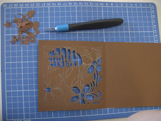
In the development stage I began to involve colour as it contributes to the 60s. Using a thicker material such as card takes longer and more effort to cut. However the advantage is the strength of the outcome, it obviously isn't as flimsy and delicate than paper.


Like the previous pieces, I would draw the design on in pencil and use only the scalpel to cut.


Thursday, 22 April 2010

Papercuttings

After researching, I responded to the style of type and patterns in the form of paper cuttings. I selected the obvious words and phrases that represent the 60s decade. To begin with, I prefer to use layout paper, which is thin making it easier to cut for a more precise and neater outcome, and is slightly transparent to help in transferring and developing designs. Planning is involved in this technique, you need to be aware of the negatives in the designs- which pieces will be removed. And if all the positives are connected- this can be difficult to see if you have a complex design.


Wednesday, 14 April 2010

Self Directed Project

For this self directed project, I chose to experiment with the patterns from the 1960s fashion and textiles.
Within handmade graphics, my chosen specialism will be paper cutting, as this technique is one of my main strengths.
I will research into 60s patterns, colours, images, and type.

Thursday, 18 February 2010

Fish: Paper Cutting- My Stamps

Here are the 4 stamps I have designed in relation to The End of the Line. The images are edited photographs of some of the paper cuttings I have produced.

The stamps in the presentation pack:

I have thoroughly enjoyed this project. I am glad I chose to specialise in paper cutting as I have produced learnt and developed a new skill which I will continue with.

Wednesday, 17 February 2010

Fish: Paper Cutting- Final Designs

These are my final designs for my stamps. Type was included on each of the initial designs, however I decided not to continue with this idea as the imagery was strong enough on its own that a word or phrase was not needed to explain the message. And also as the outcome will be a stamp (no bigger than 3x3cm) the text may be hard to read.

Fish: Workshops

In this module there were several workshops I attended to help develop my skills and ideas in this project.


The origami workshop was completely different from what I had focused deeply on for a few weeks- from small delicate 2D outcomes to large 3D objects. As a group we made a collection of sea creatures which would be suspended.


A small-medium matchbox was provided for us, and our task was to create a message related to the over fishing problem involving a fish and a human. My message is revealed by sliding the matchbox lid to the right which alters the illustration- both fish and human change slightly. The person is happy when there is fish to eat, they don't care if it is sustainable or not. The action of sliding the slide back and forth symbolises the person not changing their act on this over fishing problem.


It is vital to photograph handmade art the best you can, seeing an artist's work in photo isn't the same as real life. The photography workshop helped us to try and capture the best of our work, which I hope I have done. With all my paper cuttings I photographed with a light shining from underneath the table which helps indentify the design.

Below I experimented with shadows that looked great however it was fairly hard to capture them.


Fish: Paper Cutting- Sushi

These sushi paper cuts outs are not as affective as the previous work I have done. Also the bottom 3 are japanese inspired illustrations therefore aren't realistic and don't really fit in with the style. It isn't obvious what the images are. Sushi is recognised by its colourful appearance which these paper cuttings are lacking, only the positive and negative space of paper form the image.