Tuesday, 29 March 2011

Not all the letters (i.e. the doubles) are included in the photographs below, just the 26 letters of the alphabet:

Sunday, 27 March 2011

Wednesday, 23 March 2011

I won't need to go into detail about the following pieces and the figures in the next posts. They will be outcomes I needed to remake, or make another copy of as some words contain the same letter more than once.
I haven't actually documented the long making process, so better late than never. Here are a few photographs of making the most recent letter.

The design for this letter A will be made of 14 tubes. So the first step was to prepare my materials cutting strips of paper, it helped by curling one side of the tips with scissors to help tightly roll the paper.
Throughtout this process I have used PVA glue, which dries clear. I was quite surprised how strong and sturdy the finished outcomes were.


After my most recent tutorial at university, I received more feedback on my work so far: improvements, more experiments, and what to further work to produce with my handmade 3D type.

The thread detail on the figure below is blue, similar to the shade of the colour paper used, and the whole letter is wrapped in an orange strip of paper. The blue thread neatly binds the tubes together and wraps around the tubes for aesthetic purposes. On the side the thread is noticable against the orange however isn't as visible on the face, so I have used yellow thread to adjust this.


I really liked the outcome of one the T designs, so I have reused it for the I (below). With many of the letters I have a few different styles of them where I have continued exploring a design.

Monday, 21 March 2011

The original N and W are fine however I wanted to replace it with another letter. For example I wanted to involve the Z in the title of my work (in the Rainbow trust name) because it is a successful piece and the letter isn't a common consonant. The Z works as an N when turned on its side.


Turning the E on its side makes the W, which is a more successful figure than the original and a smaller scale is needed.
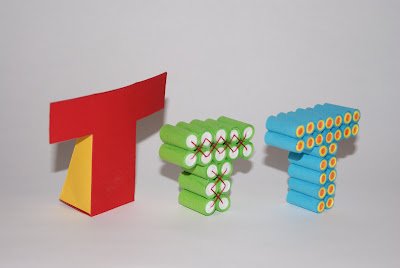
I must admit the original T is one of the poorest designs, it doesn't match the level of the other successful figures like letters O Q Z and the new A B and C as i've been informed. After understanding what pieces are most eye catching and effective, I have made sure those designs are focused on.
I found the F was a successful piece, however may not be seen as much as the letter isn't a common consonant. So I used this design for next T.

I was told that the Z was one of the most successful pieces due to its neat and tight consturction and the detail of the thread. So I have taken this feedback and continued this technique for the letter S.

Sunday, 20 March 2011

At this stage I have produced the whole alphabet, each letter is made by paper and or card. When I spelt the words Rainbow Trust I noticed a few errors which could have been avoided if I planned the whole experiment at the start. But I resolved my problems quickly and continued with the making.

Some letters needed remaking for improvement, or duplicate of a letter is needed like the R and T as there a two in the Rainbow Trust name.

The original R isn't as effective as the newer design, due to its large size and its delicate frame whereas the other two are sturdy 3D objects.
I needed to make another I at a smaller scale to fit with the rest of the letters. This simple construction is a large example of the individual rolled pieces of paper involved in alot of my designs.
Following the same process I carried for the ABC collection, I reproduced the next group of letters as the originals needed improving.

Friday, 18 March 2011

As the previous B and C were not effective individually and as a collection of 3, I have redesigned the figures which follow the same style and colour palette.