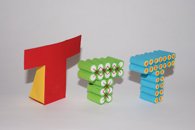
I must admit the original T is one of the poorest designs, it doesn't match the level of the other successful figures like letters O Q Z and the new A B and C as i've been informed. After understanding what pieces are most eye catching and effective, I have made sure those designs are focused on.
I found the F was a successful piece, however may not be seen as much as the letter isn't a common consonant. So I used this design for next T.


No comments:
Post a Comment